Introduction
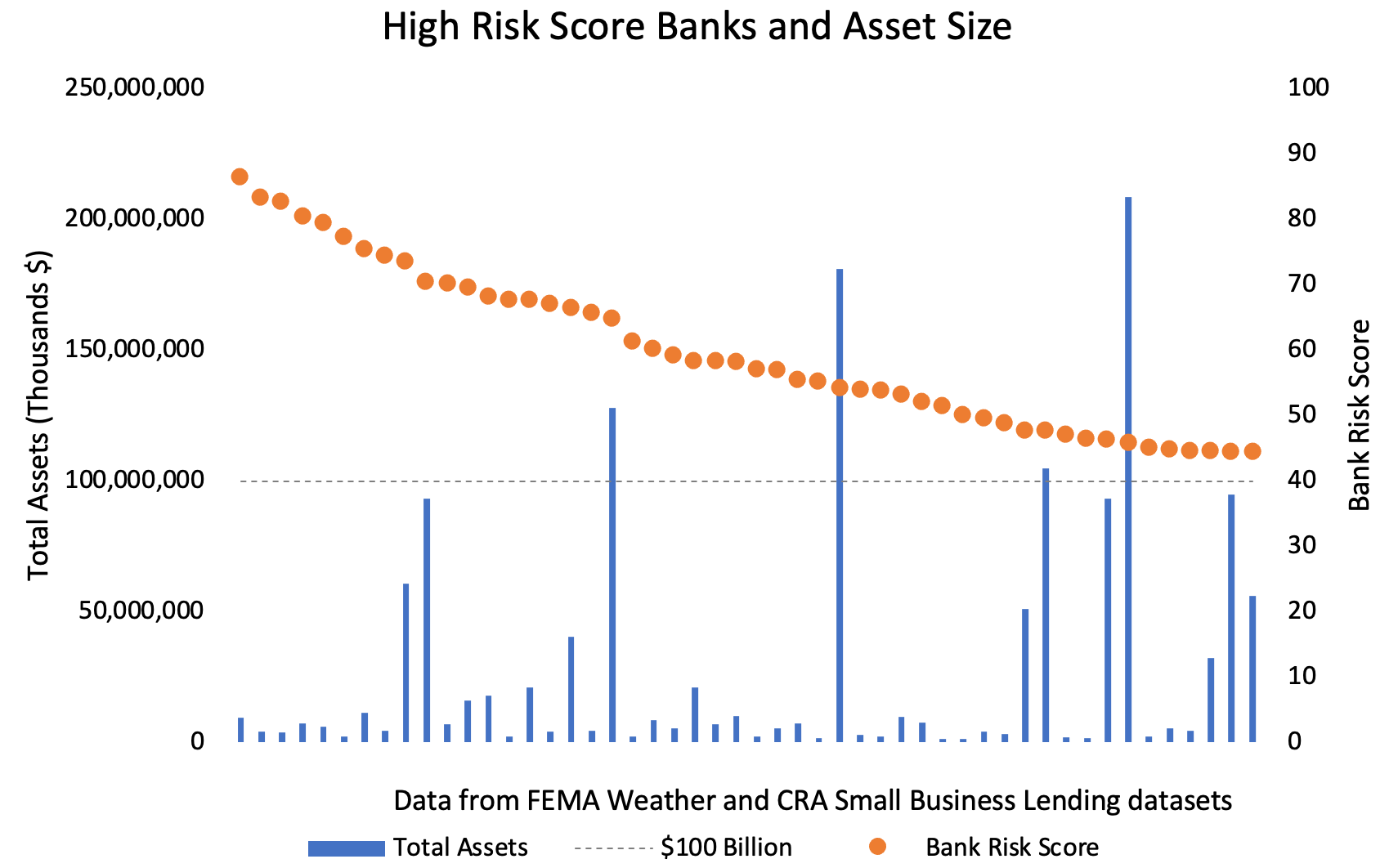
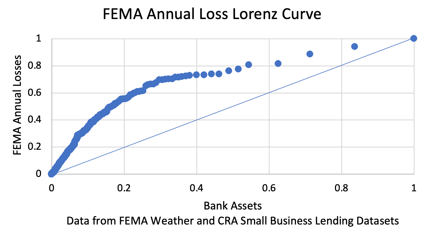
Policymakers are increasingly focusing on climate-related financial risks (CRFR) in the banking sector. Importantly, the Federal Deposit Insurance Corporation (FDIC), the Office of the Comptroller of the Currency (OCC) and the Basel Committee on Banking Supervision (BCBS) recently released draft guidance on managing climate-related financial risks. These policies apply only to large banks. In the case of the FDIC and OCC draft guidance, the proposed guidance only applies to banks with more than $100 billion in total assets. In light of this focus on large banks, we examine whether large banks are most exposed to CRFR. Using government data on the incidence of climate-related natural disasters and data on the geographic distribution of small business loans, we find that larger banks exhibit the least significant exposures to climate-related financial risks. More specifically, we find that among the 50 banks with the most exposure to CRFR, 46 of these banks have total assets less than $100 billion and have average total assets of roughly $16.5 billion. In a larger sample of over 600 banks, we find that the smallest 20 percent of banks account for over 50 percent of all estimated climate-related losses while the largest 20 percent of banks account for less than 20 percent of all such losses. As policymakers continue to consider CRFR, the lower risk of large banks relative to the rest of the banking sector should be considered.
Data-Based Estimates of CRFR
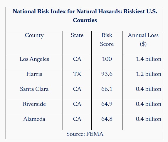
Despite the increased focus and interest in the topic, actual data-based measures of CRFR in the banking sector are few and far between. In this post, we consider two related, but distinct estimates of CRFR based on FEMA’s National Risk Index for Natural Hazards. The FEMA index uses historical data on 18 natural hazards such as heat waves, hurricanes, lightning strikes, and wildfires to estimate the annual economic losses arising in each county across the United States. Each county is then assigned a score and an annual loss estimate associated with its total natural disaster risk. The table below shows the top five counties in the United States with the highest index scores.

The FEMA index is one measure of climate risk, but it is not a measure of climate-related financial risk in the banking sector. To estimate CRFR in the banking sector, we need geographical data on bank assets. We make use of OCC data on the number and amount of small business loans (loans under $1 million) made by U.S. banks in 2020. In 2020, all banks with total assets above $1.3 billion were required to report the amount and number of small business loans made in each U.S. county they served. These data represent over 8 million loans that were made in over 3,000 U.S. counties with an aggregate value of over $448 billion, which accounts for roughly 20 percent of all commercial and industrial lending by banks. Of course, small business lending does not comprise all of a bank’s assets that are subject to CRFR, but there is likely a strong correlation in the geographic pattern of a bank’s small business lending and the rest of its assets. A bank that only makes small business loans in a few geographically proximate counties is also likely to have mortgage and consumer lending assets that are similarly geographically concentrated. Alternatively, a bank that makes small business loans all across the country is also more likely to engage in mortgage and consumer lending that is geographically diversified. Accordingly, combining the OCC small business data with the FEMA data results is a useful and credible measure of CRFR across the banking sector.
In what follows we consider two specific measures of CRFR.
- Risk Score – this CRFR measure is the weighted average Risk Score among all counties in which the bank extends small business loans. A bank that made all of its loans in L.A. County would exhibit a score of 100. Banks with higher Risk Scores have borrowers located in areas more prone to natural disasters that may impact loan losses.
- Annual Loss – this CRFR measure is the total amount of annual losses borne by each bank in the OCC small business loan sample. More specifically, for each county, we calculate the bank’s share of total small business lending in that county and then we apportion that share of FEMA’s estimated annual losses to that bank. We then sum each bank’s annual losses across each county in which it lends. As an example, if one bank made 20 percent of all the small business loans in L.A. County, it would be allocated $280 million in annual losses (0.2 x $1.4 billion) in L.A. County. Its overall annual loss would then be determined by the amount of annual losses it was allocated in every other county in which it made small business loans.
Both the Risk Score metric and the Annual Loss metric provide related, but distinct measures of CRFR. Importantly, the Risk Score does not distinguish a smaller bank from a larger bank. A small bank that does 100 percent of its lending in L.A. County will have a higher risk score (100) than a larger bank that does 100 percent of its lending in Alameda County (64.8). The annual loss metric explicitly accounts for size so that a larger bank lending in more counties exhibits a higher annual loss. Both the score and the loss metric have relevance for measuring CRFR so we consider both.
Risk Score – Top 50 Riskiest Banks
The chart below shows the Risk Score (right-hand axis) and the total assets (left-hand axis) of the 50 banks with the highest Risk Score. The bank with the highest Risk Score has a score of 87 – as indicated by the left-most orange dot – and a total asset size of $9.3 billion – as indicated by the left-most blue bar. Moving to the right in the chart shows banks with progressively lower Risk Scores.

FEMA Annual Loss Lorenz Curve
We now consider the Annual Loss metric and rather than considering only the top 50 banks, we consider all banks that report their small business lending – roughly 600 banks. Together, these banks account for $20 trillion in banking assets, or roughly 80 percent of all U.S. banking assets. The chart below shows the Lorenz curve associated with bank assets and annual losses. A Lorenz curve is a common graphical tool that is used to display how a variable is distributed across a population. The chart shows the 45-degree line that is the Lorenz curve that would result if annual losses were uniformly distributed throughout the banking sector. If annual losses were uniformly distributed across the banking sector (the $20 trillion of bank assets accounted for by these banks), the smallest 20 percent of banks would account for 20 percent of annual losses, the smallest 40 percent of banks by assets would account for 40 percent of annual losses and so on until 100 percent of bank assets account for 100 percent of annual losses.

Again, this finding can be understood in terms of risk concentrations. Large banks maintain broad, well-diversified portfolios that are invested in a variety of communities all across the country. As a result, large banks are lending in both high- and low-risk areas that, across an entire portfolio, balance each other out.
Conclusion
Regulators have increased their focus on CRFR recently. The extent of CRFR in the banking sector is not well understood at the present time. In particular, data limitations make the assessment of CRFR challenging. Using government data on the risk of natural hazards and the location of small business lending, we construct two complementary measures of CRFR. We show that larger banks are less exposed to CRFR. This is driven by the ability of large banks to broadly diversify their lending all across the country. As regulators continue to consider CRFR as a safety and soundness matter, there should be a greater effort to empirically measure CRFR across the entire banking sector and take into consideration the relatively low exposure large banks have to climate-related financial risks.
